The Clinical Command Center
Transforming a passive dashboard into a personalized clinical workspace that balances provider needs, business priorities, and operational efficiency
Role
Lead UX Designer
Timeline
Q3 2025 (Approx. 3 months)
Team
UX Design (2), Product Management (1), Engineering (5), QA (1), Clinical Stakeholders, Business Stakeholders, Compliance Stakeholders
My Contribution
As Lead UX Designer, I owned the end-to-end UX direction of the initiative. I led research planning, conducted user interviews, defined the dashboard strategy, created the Signal → Context → Action framework, designed the information architecture, led stakeholder alignment workshops, and developed interaction prototypes.
A second UX designer supported parts of the design system modernization and assisted in UI execution where needed. I remained responsible for overall UX direction, system decisions, and stakeholder alignment.
Outcome Highlights
- 40% increase in dashboard satisfaction (UMUX-Lite follow-up study)
- Improved adoption and increased dashboard utilization observed via Pendo analytics and session reviews
- Reduced navigation friction and task switching behavior observed post-launch
- Executive leadership and compliance approval secured
- Triggered broader UX modernization across core platform modules (Appointments, Patient Profile, ePrescribe, Encounters)
The Problem
The dashboard was intended to serve as the primary operational entry point for providers—combining clinical information and business priorities into a unified workspace.
In reality, it had become one of the least-used areas of the platform.
Providers consistently bypassed it, navigating directly to task-specific pages instead.
Key issues identified
- Important clinical information was buried below the fold
- High-priority widgets were not surfaced effectively
- Business-required widgets competed with provider workflow needs
- The experience lacked responsiveness, especially on iPads used during charting workflows
- Interaction patterns were inconsistent across widgets
- The dashboard became a passive information display rather than an actionable workspace
Device Context (Critical Constraint)
A key discovery was that many providers relied heavily on iPads during clinical work. However, the dashboard was originally designed for desktop-first usage, resulting in poor usability in real-world clinical environments.

Despite being intended as the platform's operational starting point, the dashboard became one of the least-used areas of the product due to poor prioritization, limited relevance, and workflow friction.
Research & Discovery
Quantitative Research (UMUX-Lite via Pendo)
To maximize participation from busy providers, I used UMUX-Lite instead of longer survey formats, which previously resulted in low response rates.
I launched and managed the said in-app survey via Pendo, achieving up to ~45% response rates among targeted active user segments.
Results indicated consistently negative sentiment toward both the dashboard and broader platform usability.
AI-assisted synthesis was used to cluster responses and identify recurring themes efficiently.
Qualitative Research
I conducted 16 one-on-one interviews with physicians and nurses to understand real-world usage patterns and workflow friction points.
Key themes included:
- Difficulty locating relevant information quickly
- Cognitive overload from excessive widget density
- Lack of alignment between dashboard layout and clinical workflows
- Frequent navigation away from dashboard to complete tasks
- Low trust in dashboard relevance
AI-assisted transcript analysis helped accelerate insight synthesis and thematic grouping.
Stakeholder Alignment
I facilitated workshops with:
- Clinical leadership
- Business stakeholders
- Compliance teams
These sessions surfaced a core tension:
Providers prioritized speed and relevance, while leadership required visibility of strategic and operational metrics.
This misalignment became a central design challenge.
Design Strategy
The redesign was guided by a single principle:
Transform the dashboard from a passive reporting surface into an active clinical workspace.
This was structured into three pillars:
- Personalization
Enable providers to tailor their workspace to their workflow. - Prioritization
Surface high-importance signals instead of equal-weight information display. - Actionability
Allow users to take meaningful actions directly within the dashboard.
The Messy Middle (Real-World Constraints)
During stakeholder validation, several conflicts emerged that shaped the final solution:
- Compliance concern: risk that providers would hide required regulatory widgets
- Leadership concern: loss of visibility for business-critical metrics
- Engineering concern: increased complexity of dynamic widget system
- Product concern: risk of inconsistent user experiences across roles
Initially, these concerns slowed approval of the personalization model.
To resolve this, I facilitated structured workshops with all stakeholder groups and introduced a governance model defining:
- Fixed widgets (mandatory, compliance/business required)
- Configurable widgets (provider-controlled)
- Priority zones for critical clinical signals
AI-assisted rapid prototyping was used to simulate behavior scenarios, allowing stakeholders to interact with realistic workflows. This helped convert abstract concerns into tangible outcomes and ultimately secured alignment.
Signal → Context → Action (SCA) Framework
To shift the dashboard from passive information display to active decision support, I designed the Signal → Context → Action interaction model.
Signal
The system surfaces high-priority clinical events requiring attention.
Example:
- 3 High-Risk Return-to-Hospital Patients
This transforms static data into actionable awareness.
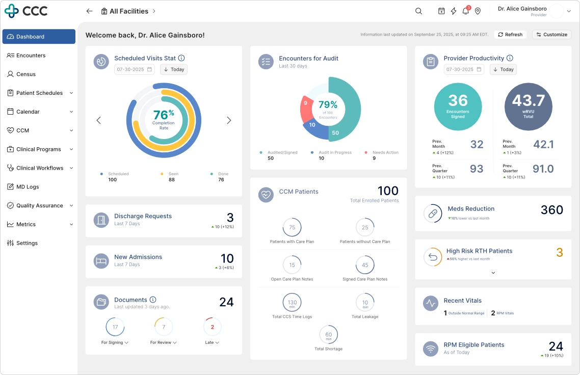
Signals transform passive metrics into actionable awareness, allowing providers to focus on what matters most.
Context
Users can expand signals inline without leaving the dashboard.
This reveals:
- Affected patients
- Supporting clinical context
- Relevant risk indicators
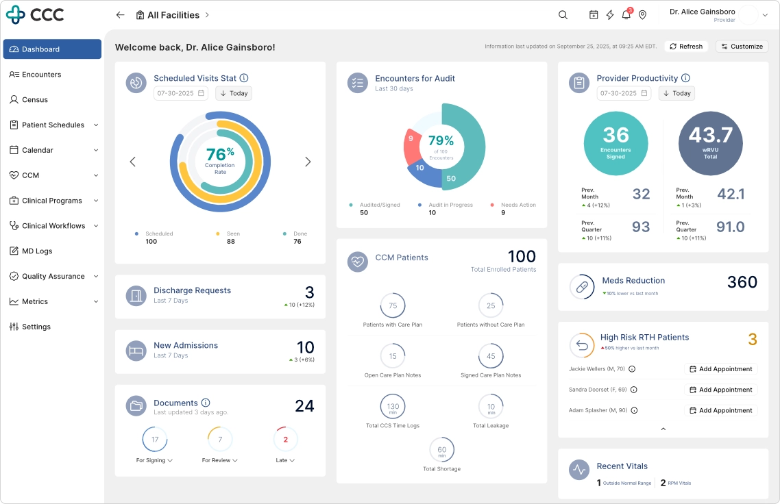
Providers can immediately understand who is affected, why attention is required, and what actions are available.
Action
Users can execute key workflows directly from the dashboard.
Examples:
- Schedule patient appointments
- Trigger follow-up workflows
- Launch encounter creation
This reduces unnecessary navigation and preserves workflow continuity.
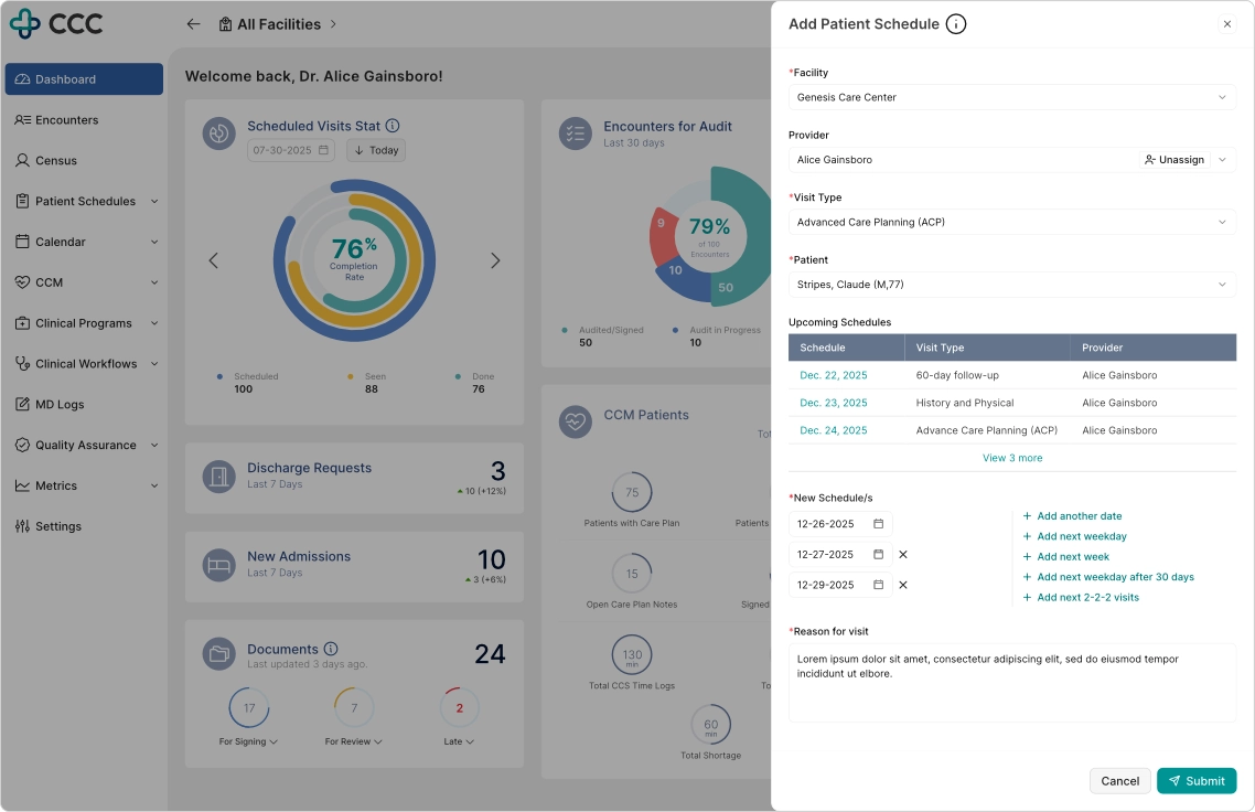
Rather than redirecting users to another module, key workflows can be completed without leaving the current context.
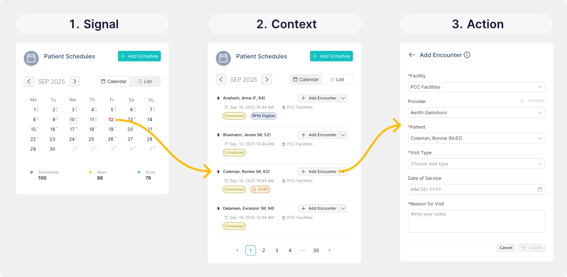
Without using a drawer, modal, nor redirecting to other pages, an SCA workflow can be done without leaving the widget
Dashboard Personalization System
Providers can:
- Reorder dashboard widgets
- Show or hide configurable modules
- Adapt layout based on workflow preference
Business-critical widgets remain fixed to ensure compliance and organizational visibility.
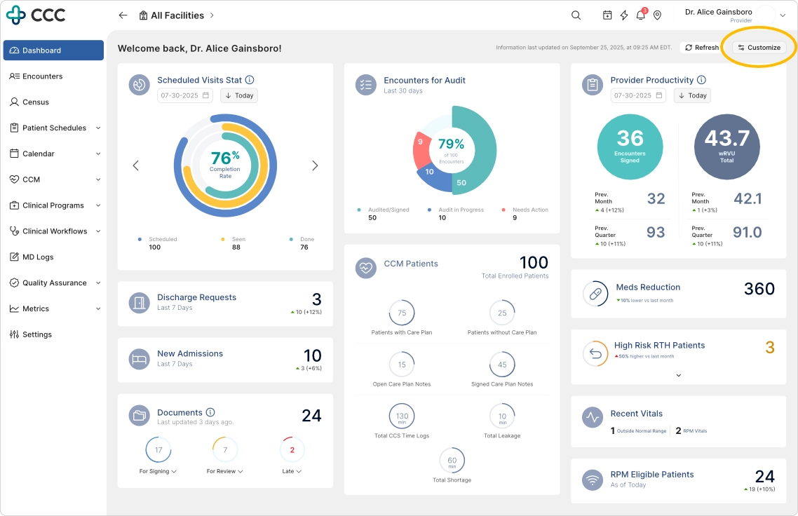
To start personalizing the dashboard, click the 'Customize' button
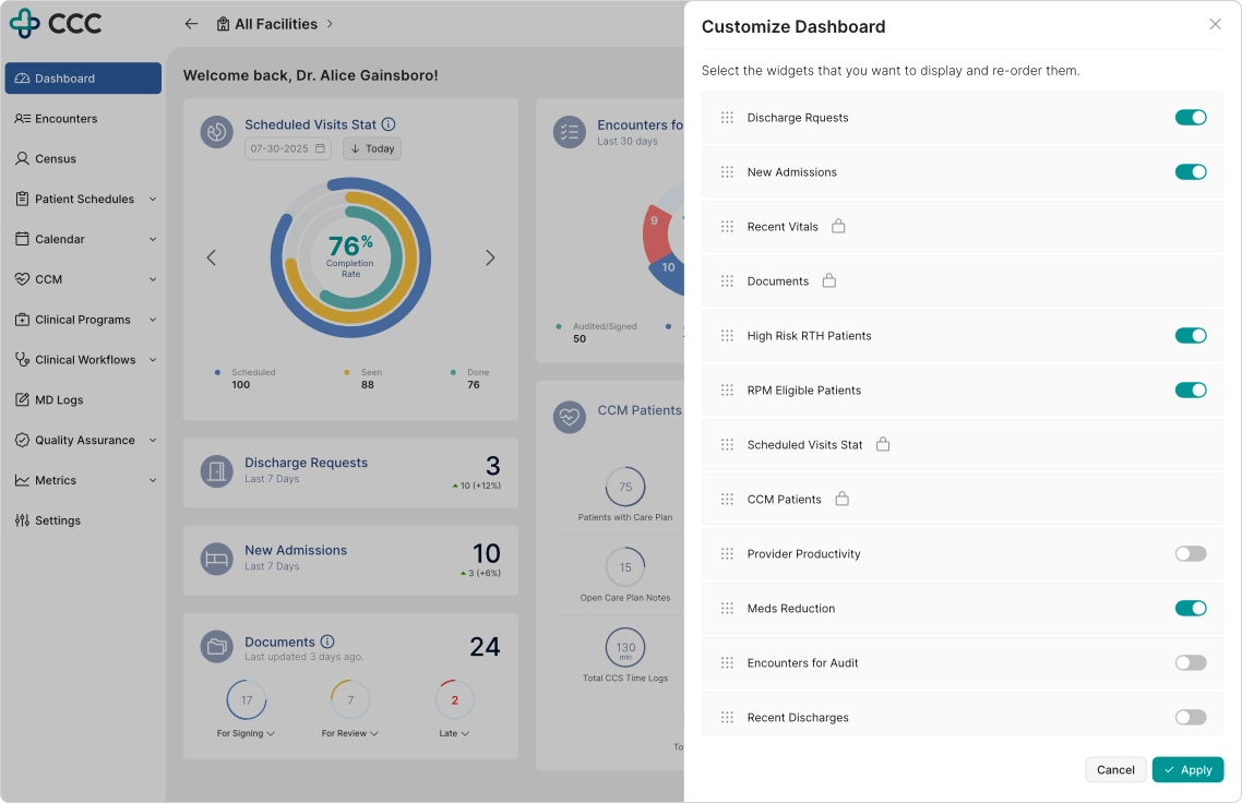
Personalization enables providers to prioritize the information most relevant to their role while preserving required organizational content.
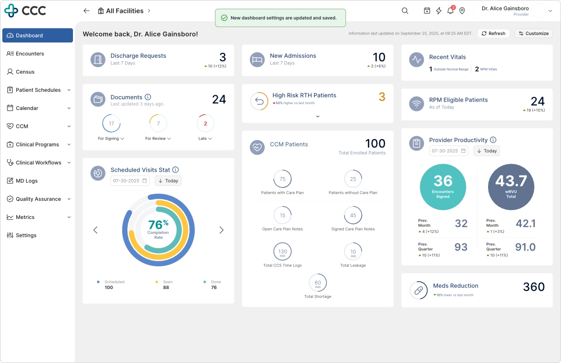
Immediate visual feedback reinforces user control and confirms successful dashboard customization.
Design System Modernization
In collaboration with engineering, I helped modernize the UI foundation using a component-based architecture.
Key improvements:
- Standardized reusable components
- Improved consistency across modules
- Reduced UI fragmentation
- Enabled faster iteration cycles
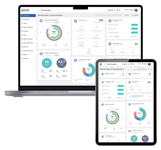
iPad-First Clinical Experience
Given the heavy use of tablets in clinical environments, the redesign prioritized iPad usability.
Key improvements:
- Responsive layouts optimized for portrait and landscape modes
- Drawer-based interactions instead of full-page transitions
- Larger tap targets for in-motion usage
- Preserved state interactions to reduce workflow disruption
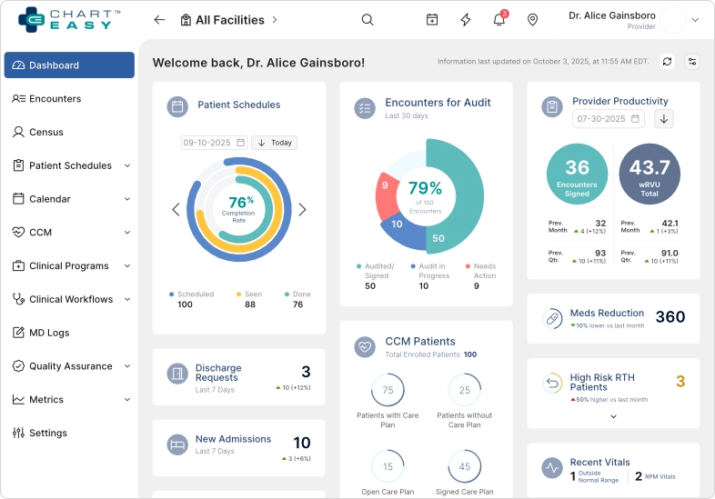
The responsive layout adapts seamlessly to iPad landscape mode, a common environment for provider charting workflows.
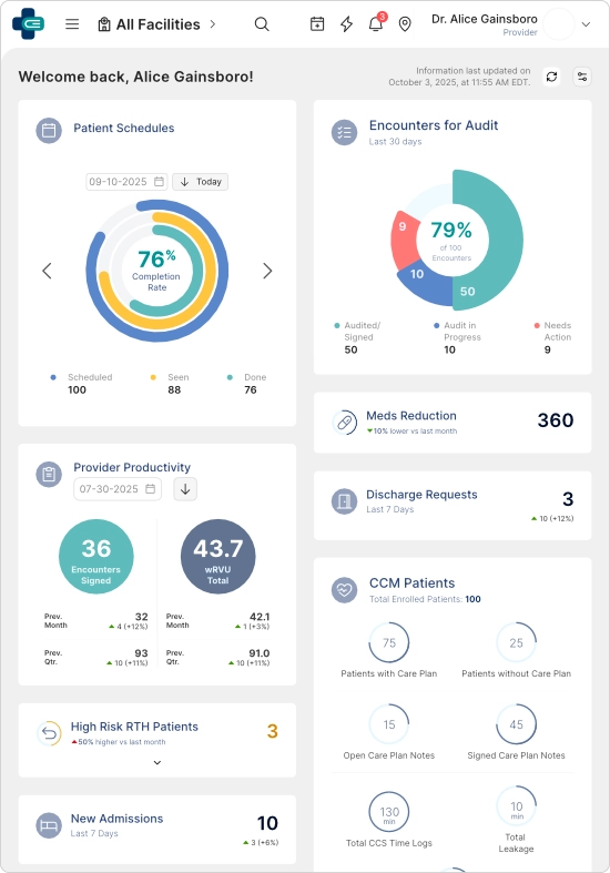
The redesigned experience maintains information hierarchy and interaction quality even in constrained screen sizes.
Outcome and Impact
Following deployment, a follow-up UMUX-Lite study was conducted.
Measured Outcomes
- 40% increase in dashboard satisfaction
- Increased adoption and usage observed via Pendo analytics and session behavior
- Reduced navigation friction across clinical workflows
- Strong positive feedback from providers, compliance, and executive stakeholders
Beyond direct metrics, the redesign influenced a broader platform-wide UX transformation across:
- Appointments
- Patient Profile
- ePrescribe
- Encounter workflows
Reflection
This project reinforced a core principle:
A clinical dashboard should not function as a static reporting surface.
It must act as a decision-support workspace that helps providers:
- Identify what matters
- Understand context quickly
- Take action without friction
By balancing competing stakeholder priorities and introducing the Signal → Context → Action framework, the dashboard evolved into a system that aligned clinical workflows with organizational goals while improving usability and adoption.