Medicarry: A Mobile App Born in a Pandemic, Built for the Future
In May 2020, as Singapore locked down under its Circuit Breaker, my neighbor—a retiree with diabetes—worried about refilling her prescriptions without stepping outside. With strict stay-home rules, she wasn’t alone. Thousands of elderly individuals, caregivers, and those in remote areas faced the same challenge.
That’s when I started Medicarry, a mobile app designed to bring pharmacy services to those who need them most. While born out of a pandemic, the solution remains relevant in 2025—helping caregivers, seniors, and anyone struggling with pharmacy access.
My Role
I led the user experience strategy and design for Medicarry. My responsibilities included:
- Conducting user research through Zoom interviews and surveys in Singapore.
- Running virtual workshops to brainstorm with teammates.
- Building user flows and information architecture.
- Creating wireframes, high-fidelity mockups, and clickable prototypes.
- Leading usability testing and iterating on feedback.
- Setting up a basic design system for consistency.
User Research and Design Process
Getting to the Root: Understanding User Needs
To validate the problem, I conducted 12 user interviews during the Circuit Breaker period. Participants included a father trying to avoid crowds, a nurse balancing caregiving, and a retiree wary of long pharmacy queues.
Key Insights:
- Avoiding public spaces was a priority for seniors and caregivers.
- Medication adherence was a challenge without reminders.
- Pharmacy access was inconvenient, especially in remote areas.
Based on these insights, I developed three user personas:
- Ben, 38: A father isolating at home, skipping pharmacy visits.
- Nancy, 67: A retiree shielding at home, needing prescription refills.
- Gigi, 52: A nurse living far from major pharmacies.


User persona cards
Design, Prototyping and Testing
Sketching a Fix: From Ideas to Structure
With well-defined user needs, I mapped user flows in Miro, detailing key interactions from sign-up to prescription uploads and delivery tracking.
I began with hand-sketched wireframes to quickly explore layout ideas and facilitate early feedback.

Some of the initial handsketch wireframes for Medicarry
I then refined the wireframes in Figma, focusing on:
- A simple onboarding process for ease of use.
- Prescription upload functionality via camera.
- A structured medication catalog for easy browsing.
- Delivery tracking and reminders for medication adherence.

Medicarry's refined userflow
Making It Real: Prototyping & Testing
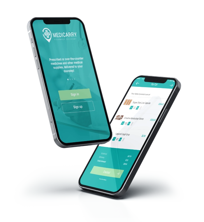
I built an interactive high-fidelity prototype with core functionalities:
- Medication catalog with clear, readable text.
- Prescription scanning for fast, paperless uploads.
- Custom medication reminders to enhance adherence.
- Delivery tracking with real-time status updates.
- Pharmacy locator for non-delivery options.
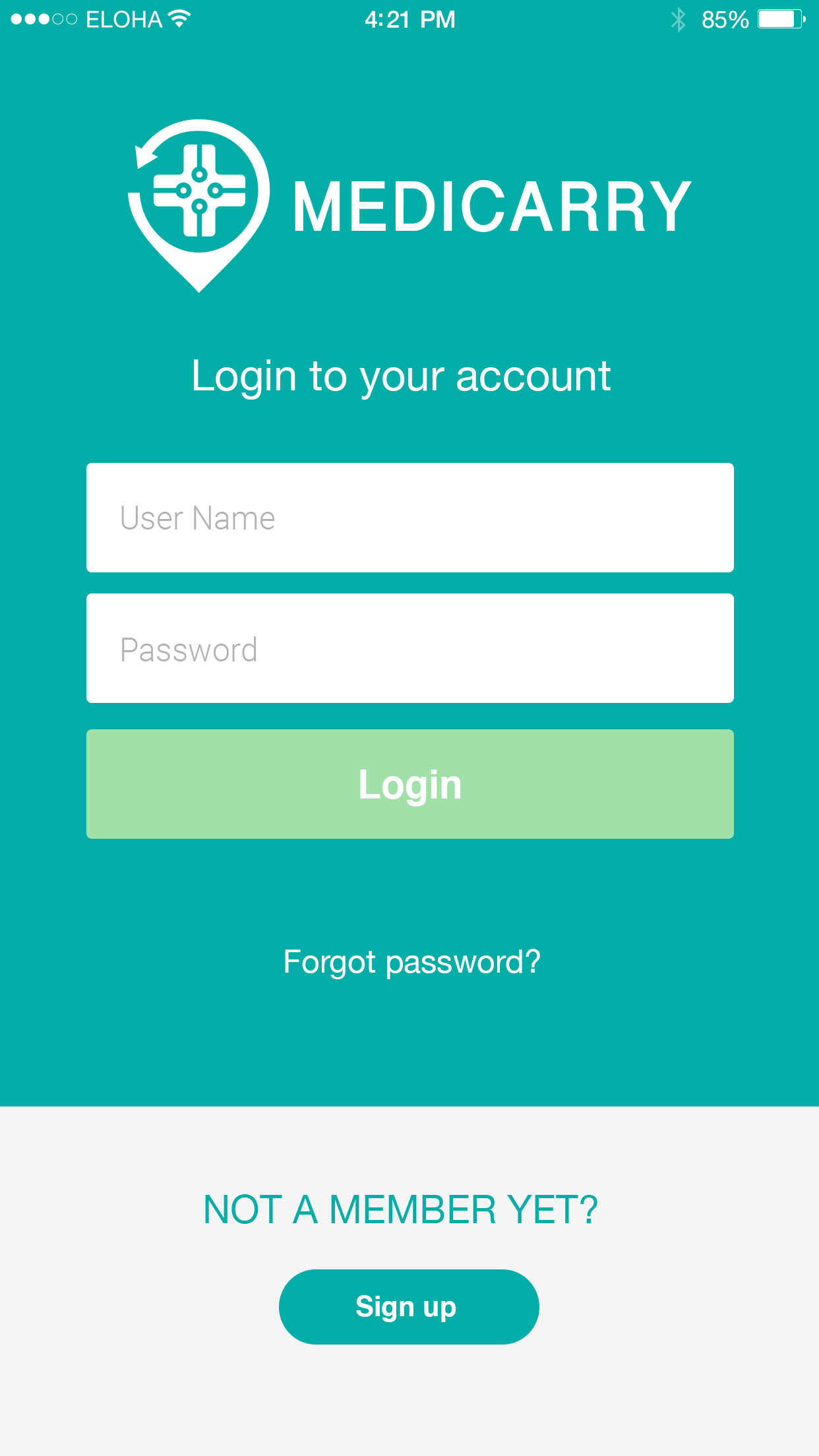


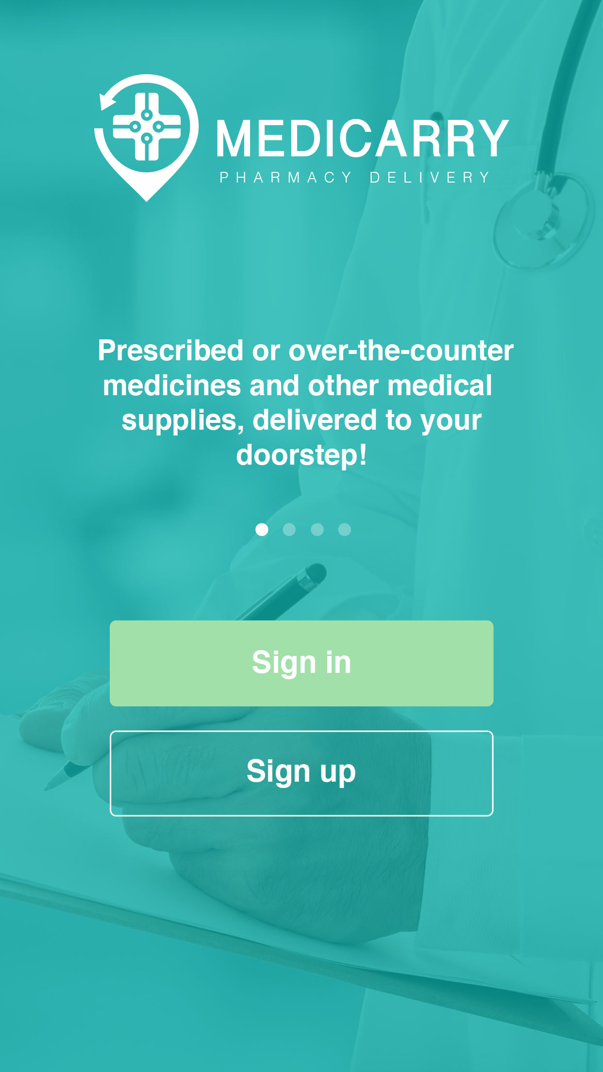
High-fidelity screens for Medicarry
To validate the design, I conducted usability testing with six users over Zoom. One key insight was the need for clearer delivery tracking. Users wanted real-time status updates, so I refined the tracker to include live updates and estimated arrival times.
Testing the Waters: Final Validation
By November 2020, the MVP was ready—fully tested and refined. I conducted a final round of testing with 10 users via Google Forms, and the results were promising:
- 90% said Medicarry would reduce unnecessary trips.
- 95% found the reminders highly effective.
- 85% considered it a game-changer for pharmacy access.
Looking Back: Key Takeaways & Next Steps
Medicarry reinforced the power of user-centered design in solving real-world challenges. Designing in a high-pressure, time-sensitive environment during Singapore’s lockdown pushed me to iterate rapidly and prioritize accessibility.
If I were to refine the solution further, I’d introduce voice controls to enhance usability for seniors, as small buttons were a pain point for some users.
Medicarry started as a response to a crisis, but its impact goes beyond the pandemic—helping people conveniently and safely access medication when they need it most.